














Target attaches great importance to their own color system.
The iconic red color of this retailer, which is also Pantone 186, is a bright and highly saturated shade that makes its bullseye logo stand out prominently among the crowd. Whether on subway platforms or in suburban shopping centers, this color easily captures attention.
A new clothing line designed in collaboration between Target and Isaac Mizrahi, intended solely for employee wear, has been named Collection 186. Twenty years ago, Target purchased the entire ad space of an issue of The New Yorker and required the magazine's illustrators to use only three colors: black, white, and red.
However, when renovating the New York SoHo store last year, this red trademark color was used on almost every element at the entrance, which ended up looking a bit overdone.
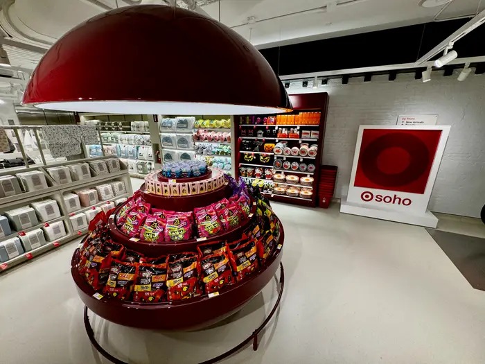
Target, the Chief Brand Officer, stated during an exclusive store visit last week regarding Business Insider: “It was a bit too intense, so our design team added a color that we now refer to as Cherry Stain to balance the presence of red. It has now become part of the Target IP color palette.”
This new Cherry Stain color appears on multiple devices in SoHo stores, but its more prominent use is as the official color tone for the newly launched Beauty Studio department. This year, Target is promoting this color to all stores.
This is a more tranquil and attractive shade that not only matches the main red color but can also serve as a substitute when the target red appears too intense.
The company is now also using this color in more scenarios, including some Target logos. These logos are now presented as a combination of Pantone 186 and the new Cherry Stain, rather than the traditional red and white color scheme.
Mesenburg said, "This is a new chapter. We are absorbing the elements we have learned from SoHo. It may not be copied exactly one-to-one, but this influence will permeate the entire chain system."